Case study
LG.com BRAND & ECOMM OVERHAUL
Smoothing out the customer experience for LG
Multi-group
design system
50+ product categories
LGE US revenue was $1.3B in 2021
Introduction
Background
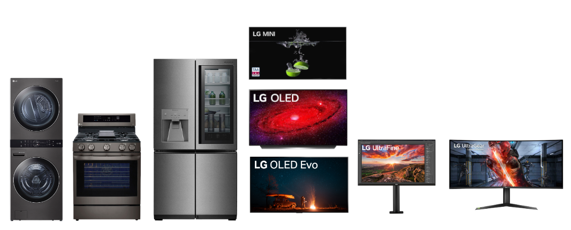
LG is a consumer electronics giant
LG makes mass-premium products in many categories. LG has a major presence in home appliances, which tend to be in the kitchen or the laundry room; meanwhile LG has products for the living room, with TVs, speakers, and laptops, which have a more tech-centric mood. There are a host of LG B2B products for almost every kind of business category. All of these product lines have differing business and target priorities.
Problem
LG North America office was given control of lg.com
The previous version of the site had been architected and developed by a global group. The US group was given the challenge of revisiting.
Constraints
Covid19 time pressure
The project had to deal with the realities of Covid, which meant changing process, but also heightened the business case for a more effective shopping .com experience.
Legacy tech stack and framework
The older framework came with a complicated set of problems that took an unexpected number of phases to correct. This meant following multiple work streams to upgrade the older system stack while working on future potential states.
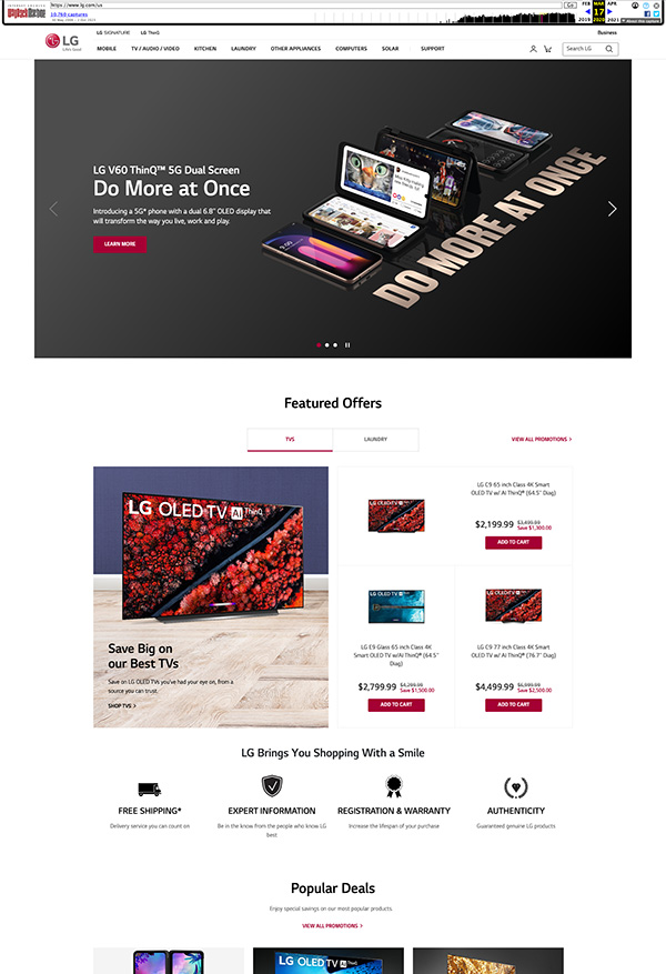
2019 Version of US site
Audience
Mass-premium audience
Primarily purchase-intended home owners aged 40+ in US. Site structure would also eventually be rolled out for global use.
Process
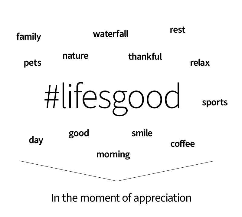
Using social listening to determine: What does Life’s Good mean?
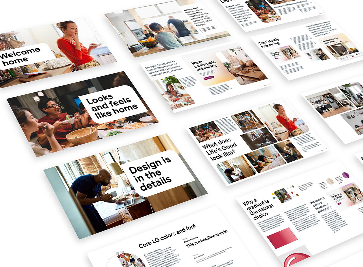
We started by looking at the point of confusion. Why was there inconsistency? Using a variety of marketing research tools didn't get into the cutlural point of view of the "positivity" of Life's Good.
These different product points of view all have one destination: LG.com, where it's critical to establish a consistent feeling. Research showed customers believe Life's Good means being thankful and living for moments of joy, so we interpreted that in language and visuals that were natural, unposed, and at the intersection of real life and optimistic truth. It allows you to tell a story about the real product experience instead of just showing a technical point of view.
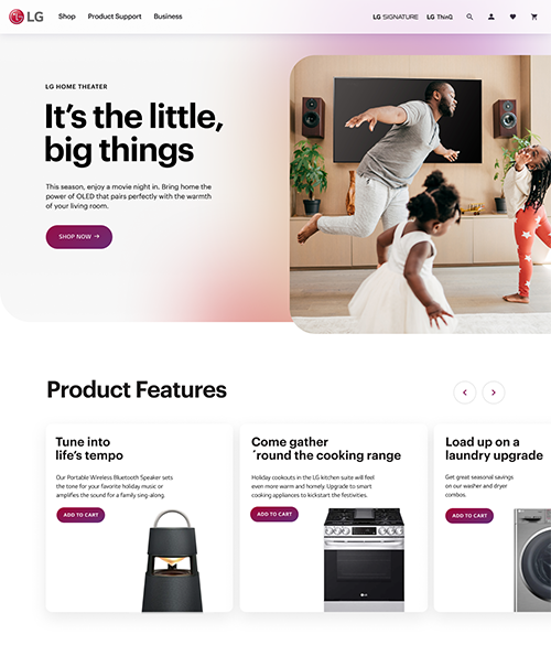
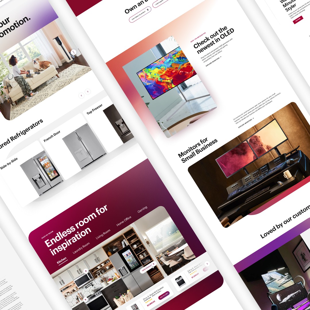
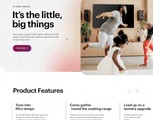
Making premium tangible and relatable by showing in-context product benefits: Life’s Good in Real Life
How to show that in-real life application required rethinking the contextual relevance of the product benefit in a cross-section of premium but relatable visuals and messaging. Testing of headline treatments and visuals revealed customer prefereces for relatable positive vibes in color and photography with straightforward but friendly copy style.
Creative needs to work seamlessly. The brand's elements and components were reviewed. Then, extensions aligned with its core truths were methodically created, such as this product-first seasonal holiday promotion example. This approach was built as a repeatable, seasonal system for all promos throughout the year.
Using workshops and sharing sessions to gain alignment
Multiple groups needed to be included in the decision-making process. There were many points of use by internal teams. Multiple sessions with global and local teams were run by the senior leads of teams, including ECD of brand, senior director of design, and VP of UX, as well as external strategy and design contributors. The lead stakeholder of the overall organizational group did a masterful job of gaining visible alignment in multiple cross-organizational meetings.
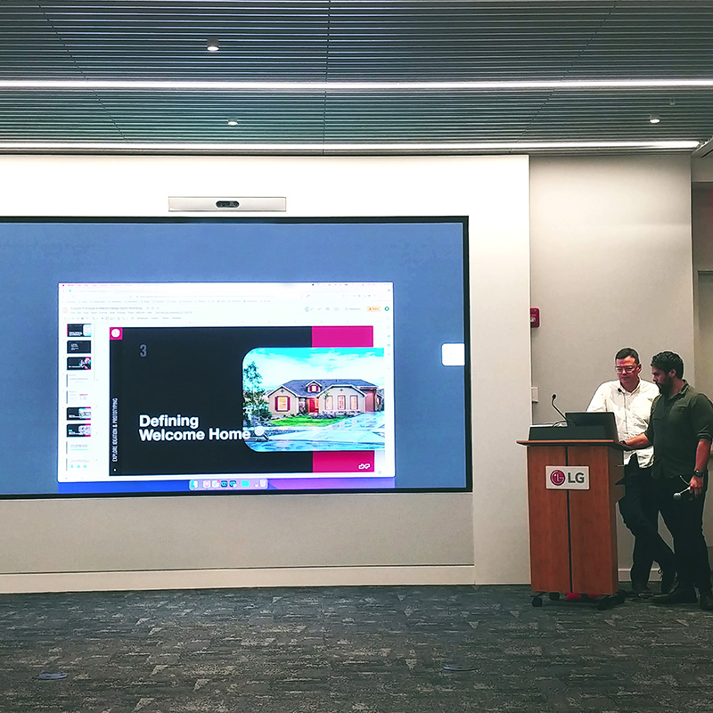
Welcome Home workshop
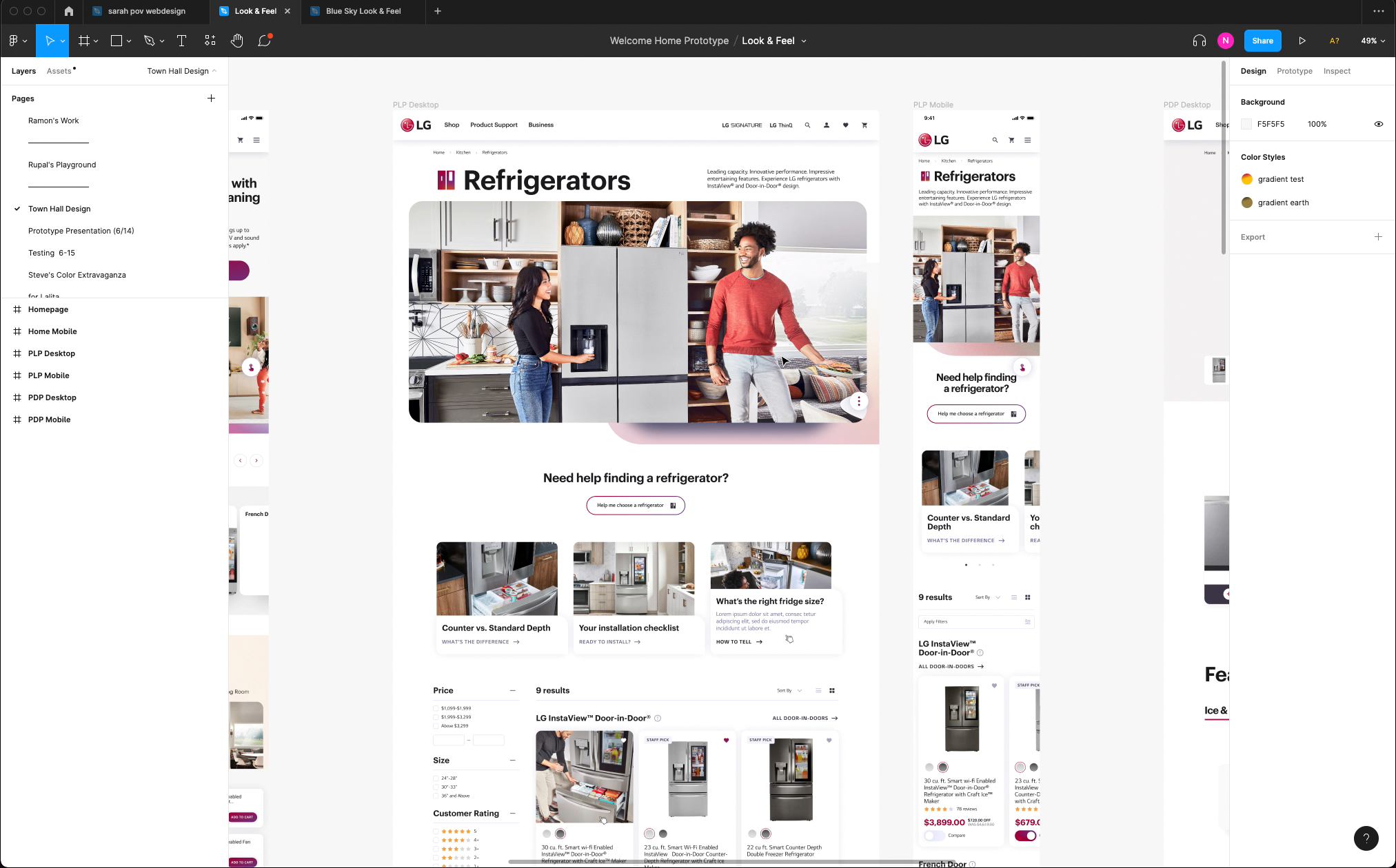
Section-by-section refinement of cart, category, and product pages
Another major point of improvement, once the underlying tech stack could be addressed, were several improvements around ordering product against stock inventory, alignment of shopping principle benefit hierarchies, the sorting of product, and other QOL shopping improvements.
The shopping workstream followed a tight product refinement approach, using section-by-section sprint-based phases. This was initially led by MISC design (who did an amazing job) and included internal staff. As the internal staff was onboarded and the design stream surpassed the development team, a longer-term staffing was put in place, following the same core methods put in place by MISC, and included a long-term engagement for PM tasks with them.
Humanizing and softening look and feel with experimental design sprints
The site needed to be rethought for better consistency and integration with the brand content teams. A separate design workflow using multiple design contributors that focused on photography, messaging and color included multiple open approaches. Play was encouraged for more human integration of brand elements.
Using design systems, guides and content organization for integrating assets and messaging
In order for the organization at large to take advantage of all the work that had been done, it needed to be provided in a digestible form to the content marketing team.
Outcome
Functional style became a seamless flow
A challenge in the project was aligning stakeholders and the brand content teams alongside the challenges of a rather enourmous tech-debt to be overcome which pushed timelines further back than the design team anticipated.
In the end, LG now has a momentum that feels more consistent, and the shopping experience is much improved. There are consistent undercurrents that all of these artifacts in the ecosystem share.
Get in touch
Reach out to have an initial conversation session to see if we are a good fit. My design philosophy can be developed in a number of different ways. I look forward to getting to know you better.