Pfizer navigation and IA
UX/UI Case study
Pfizer underwent a significant change in content organization when it acquired Wyeth, another pharmaceutical giant. So not only did its site structure and contact need updating, it required a significant rethink of how the navigation and design work with what was essentially twice as much content as the site had before. Navigating through all of that content was a large information architecture project. After many steps with many different groups, a consensus was eventually reached. There also presented an opportunity to expand some of the already determined sections with new content and more visual expressions.
Information types merger
Navigation updates across whole site
Pfizer and Wyeth's $68B combined
Interviews started the research
Managing this much information was an enormous challenge. There was a significant new injection of content and information types due to Pfizer's acquisition of Wyeth. The task required updating the site structure and content and rethinking how the navigation and design work with twice as much content as before. The challenge was managing the site's complexity while making it easy for users to find their planned information.
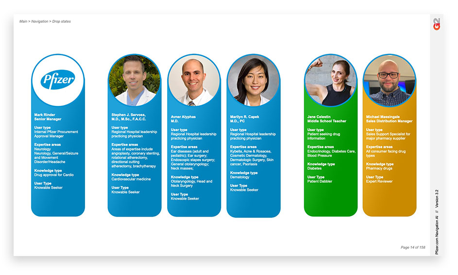
Both client and customer interviews were conducted to inform how to structure the information architecture. User research was essential to understand how people use the site and their needs. The discussions helped the design team to create a user-centered design that is easy to navigate, with a clear and concise structure that is easy to understand.
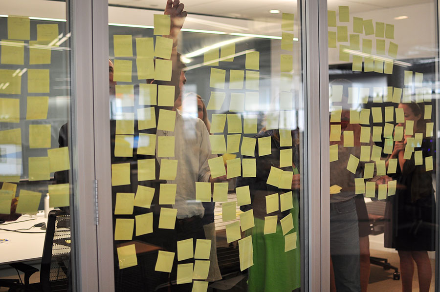
User sorting with real people
User sorting helped ensure that a potential customer of any type and knowledge level could easily search and find what they wanted. The design team had to consider the different types of users, from those with extensive knowledge of Pfizer's products and services to those new to the company. They ensured that the website was easy to use and that the information was accessible to everyone, including those with disabilities.
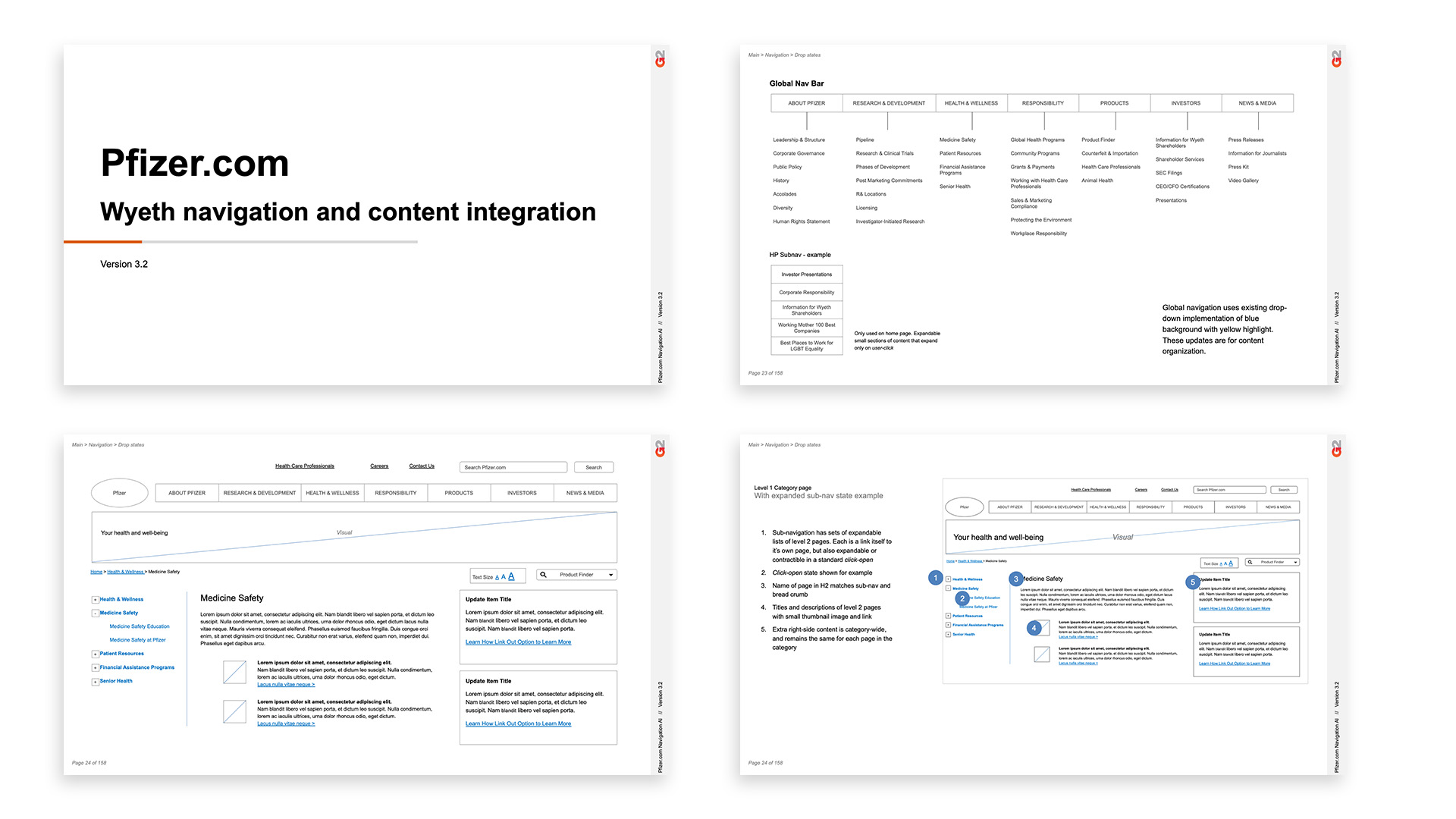
Comprehensive wireframes
The information architecture was developed into detailed wireframes that showed how the site would function, the navigation, and the content hierarchy. Different groups, including end-users, reviewed and tested the wireframes to ensure the design met their needs and that the site's flow was intuitive and straightforward.
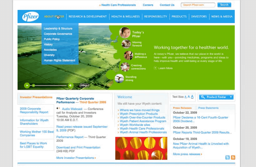
Building on existing UI
The team had to work within the existing design and branding framework to create a cohesive site that was easy to use and navigate. They incorporated new elements and visual expressions while keeping the overall look and feel consistent with the existing legacy content and style.
Finding the flow of information
Seamlessness at scale requires excellent organization. The sheer amount of information that Pfizer had to manage required a robust information architecture organized at a library sciences level. The design team had to ensure that the website could handle the scale of information and that it was easy to navigate, find, and understand. The site had to be intuitive and user-friendly, even with its vast knowledge.
Get in touch
Reach out to have an initial conversation session to see if we are a good fit. My design philosophy can be developed in a number of different ways. I look forward to getting to know you better.